Interactive design reconstruction / InkSoft
Disney Villains
An enchanted mirror, a darker palette, and a cast-and-crew collection with character.
Try the experience
Step inside the storefront.
Explore the animated entrance, browse the collection, and try a product’s options. This self-contained reconstruction uses saved project artwork. Example product names and options illustrate the design; they are not a live catalog.
The collection
The cast & crew collection
For the team behind the curtain.
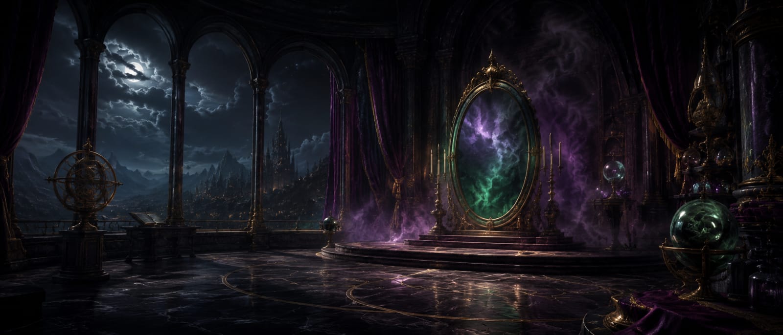
Step through the mirror. Find your next look.
Made for the moment
A little darkness. A lot of character.
An enchanted forest, an ornate mirror, and a collection with a darker side. Browse the silhouettes in violet, emerald, and midnight.
From entrance to selection
A complete journey, with a sense of occasion.
The entrance sets the mood, makes the collection easy to understand, and gives shoppers a clear way forward. Cinematic artwork does the storytelling; real HTML controls provide navigation and accessible actions.
Behind the build
Branded storefront UX & reusable React components
An ornate mirror entrance and coordinated product journey, reconstructed with a shared React storefront engine and a distinct CSS theme.
- Original storefront
- InkSoft
- Custom HTML
- Scoped CSS
- Responsive design
- Public reconstruction
- React
- TypeScript
- Vite
- Cloudinary
- Platform-aware storefront design
The original presentation works within InkSoft’s hosted storefront. Its custom entrance and category paths complement the existing product, account, cart, and checkout functions.
- A reusable component system with its own identity
Typed theme data selects the mirror artwork, category images, violet-and-emerald palette, and product imagery. Scoped CSS creates the parchment collection and product surfaces; decorative CSS particles add atmosphere around usable HTML controls.
- React components and product browsing
Typed theme and product data drive reusable collection cards, category filters, text search, product inspection, size and quantity controls, and a temporary demo bag. React state keeps selections together as the visitor moves between views.
- Responsive frontend and motion controls
Scoped CSS adapts the layout to narrow screens. Native buttons, labeled inputs, focus management, and a modal artwork viewer support keyboard use. Decorative effects pause offscreen or in a hidden tab and respect reduced-motion preferences.
What you can try here
The portfolio version rebuilds the interface in React: collection filters, search, product detail inspection, size selection, quantity, and a temporary demo bag. Each collection carries its own palette, typography, imagery, and atmosphere across the journey. All demo actions stay here, with no checkout or account required.
Built for different screens
Layouts need to accommodate narrow screens, landscape phones, long labels, and the platform’s existing markup. Static imagery is paired with live controls rather than making the whole interface a picture.